Vibe - Enhancing connectivity and engagement
between students and universities
TIMELINE
UX Researcher
UI Designer
ROLES
TOOLS
After Effects
Figma
Figjam
Miro
3 Weeks
Students have a hard time finding their people, and staff juggling with too many tools
Students struggle to connect with peers, find relevant clubs, network with professors, form study groups, and feel a sense of community. On the other side, universities manage these needs through multiple, disparate tools, making the process cumbersome for administrators and reducing overall student engagement.
Creating a product that connects the students, and eases the university
To create a seamless digital product that enhances student connectivity, promotes campus engagement, and eases the administrative burden for staff members in charge of the university.
Existing platforms cover parts of the problem, but none offer a seamless, all-in-one solution
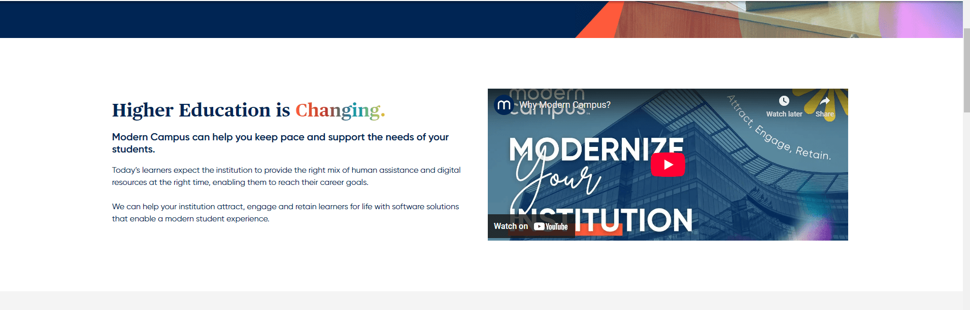
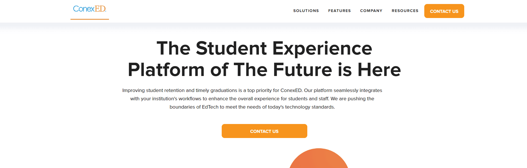
We have two main competitors, Modern Campus and ConexED, to identify market gaps and opportunities. Modern Campus is highlighted for its user-friendly interface that fosters participation, comprehensive tools for students and administrators, and a strong emphasis on community building. It also focuses on direct communication, offers flexible tools for diverse educational environments, and encourages student-faculty collaboration.
However, both platforms share similar weaknesses: they struggle with seamless integration into existing university systems, require continuous updates, and lack advanced functionalities compared to broader solutions, necessitating further integration for optimal effectiveness.

Right now, neither students or staff have the right tools to make connecting easy
We began by interviewing the key players within our existing market (our university) to gather direct insights. Our participants included:
Faculty Member Kim

Dedicated to creating a cohesive and vibrant campus community, looking for new ways to strengthen the connection between students.
CORE BELIEVES
Limited student engagement, difficulty building a cohesive campus culture, difficulty in managing diverse student needs, no student insights beyond basic data.
CHALLENGES
Regularly uses communication platforms and management software on the school website to enhance campus operations and student experience.
DIGITAL BEHAVIOUR
Enhance student engagement in communities on campus, foster a supportive and inclusive environment, ability to accurately track data, and maintain high levels of retention rates.
CORE BELIEVES
International Student Marky

Adapting to a new environment, seeking academic success along with a supportive social network, hoping to find a second home with others who share their passions.
CORE BELIEVES
Making new friends and connections, language barriers and cultural differences, navigating international student processes, finding resources and support services.
CHALLENGES
As an international student, relies on digital tools for information, navigation, shopping, and daily tasks to adapt to his new environment.
DIGITAL BEHAVIOUR
Adapting to a new educational system and culture, building a social network, achieving academic success while managing homesickness.
CORE BELIEVES
Navigation through the Vibe experience
We mapped the user's journey to identify key pain points and opportunities for intervention.
Start
Onboarding
Account
New Register
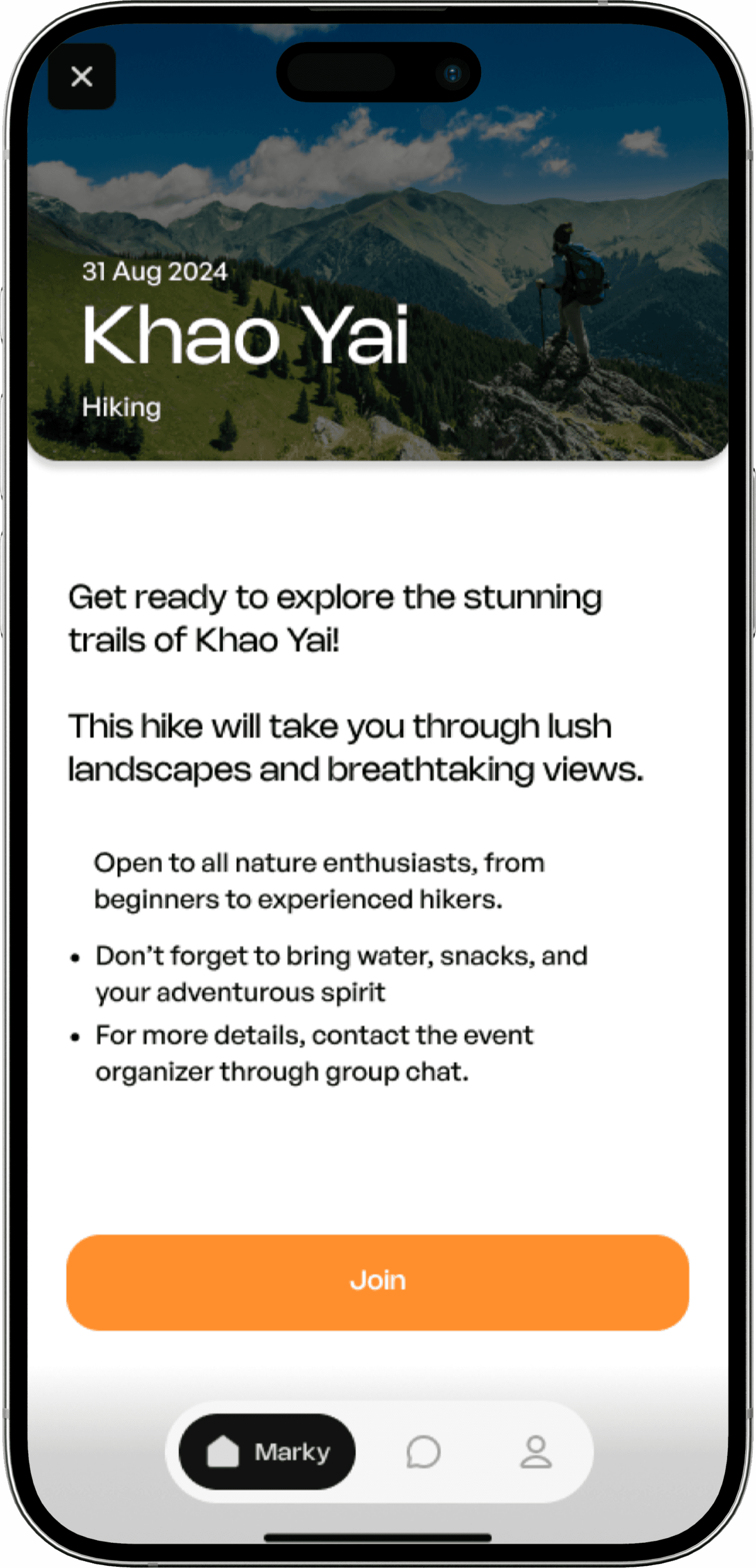
Home Page
Event
-Recommendation
Find people
in Event
Vibe check
the person
Match vibes
Personalized
suggestion
Choose
Event
See event
details
Join Event
Sign In
Making sure our users progressively feel better
We mapped out their entire journey, starting from that first spark of discovery—whether through an ad or a friend's recommendation. We considered how to make signing up feel welcoming and secure, addressing concerns like privacy head-on. Then, we focused on the magic: helping them easily find and connect with people who share their unique passions. We envisioned them engaging with exciting events and, crucially, feeling empowered to share their feedback, knowing their voice shapes Vibe's future. Every design choice was about anticipating their needs, smoothing out frustrations, and creating a genuinely delightful experience.
Discovery
Sign-Up &
Onboarding
Explore &
connect
Enagage with events
Feedback &
Retention
User action
Sees ads or hears about Vibe through social media or word-of-mouth.
Visits the app store to download Vibe.
Explores the homepage for more information
Signs up with email,phone, or social account.
Fills out interest and preferences for personalization
Completes onboarding with short tutorial about app features
Browses profiles, find matches based on shared interests.
Sends/receives connection requests and starts chatting
Explores personalized event suggestions
Views event details, join events, and connects with peers.
Uses event channels to interact with attendees.
Gets notification for upcoming or relevant events
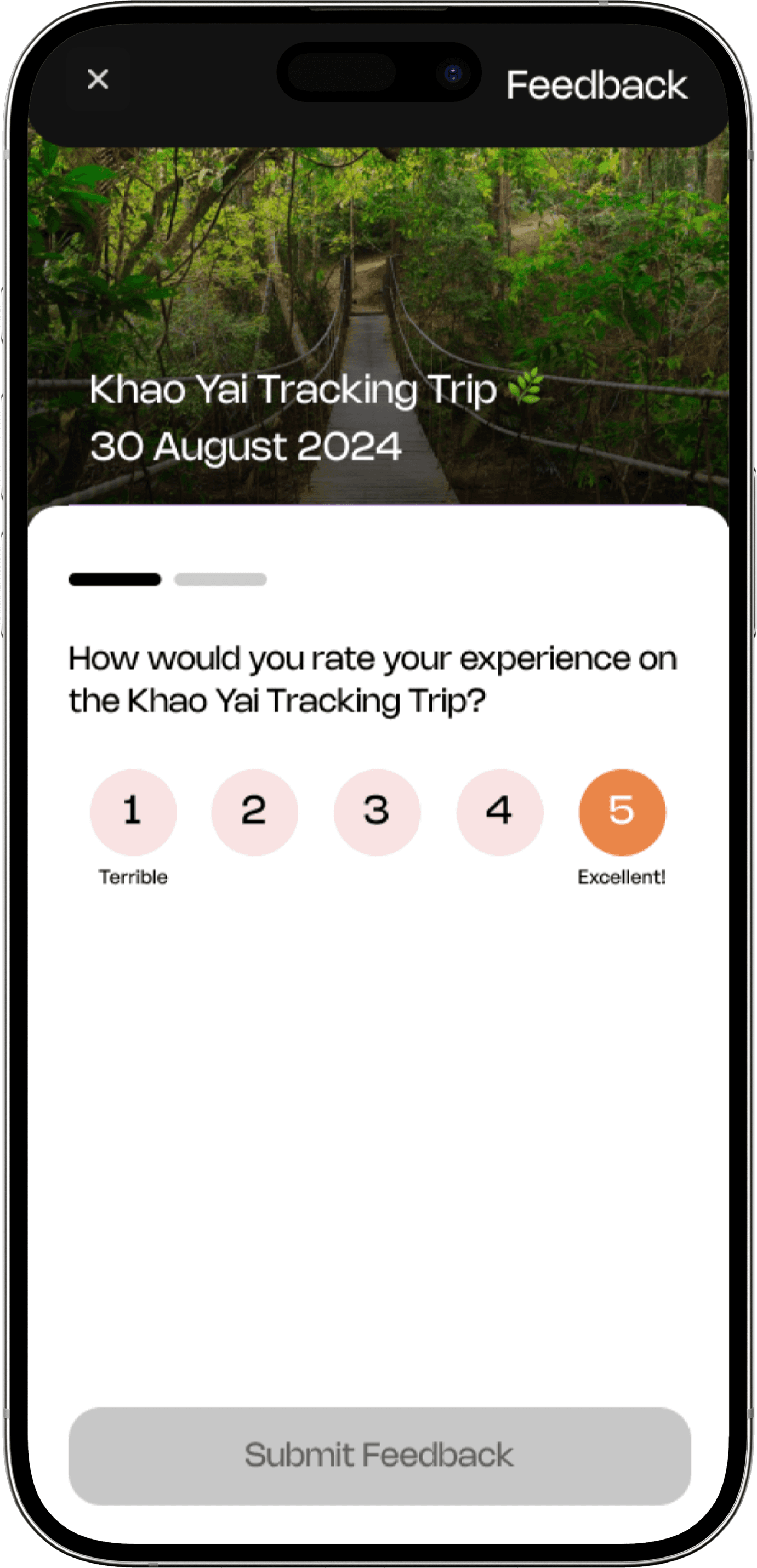
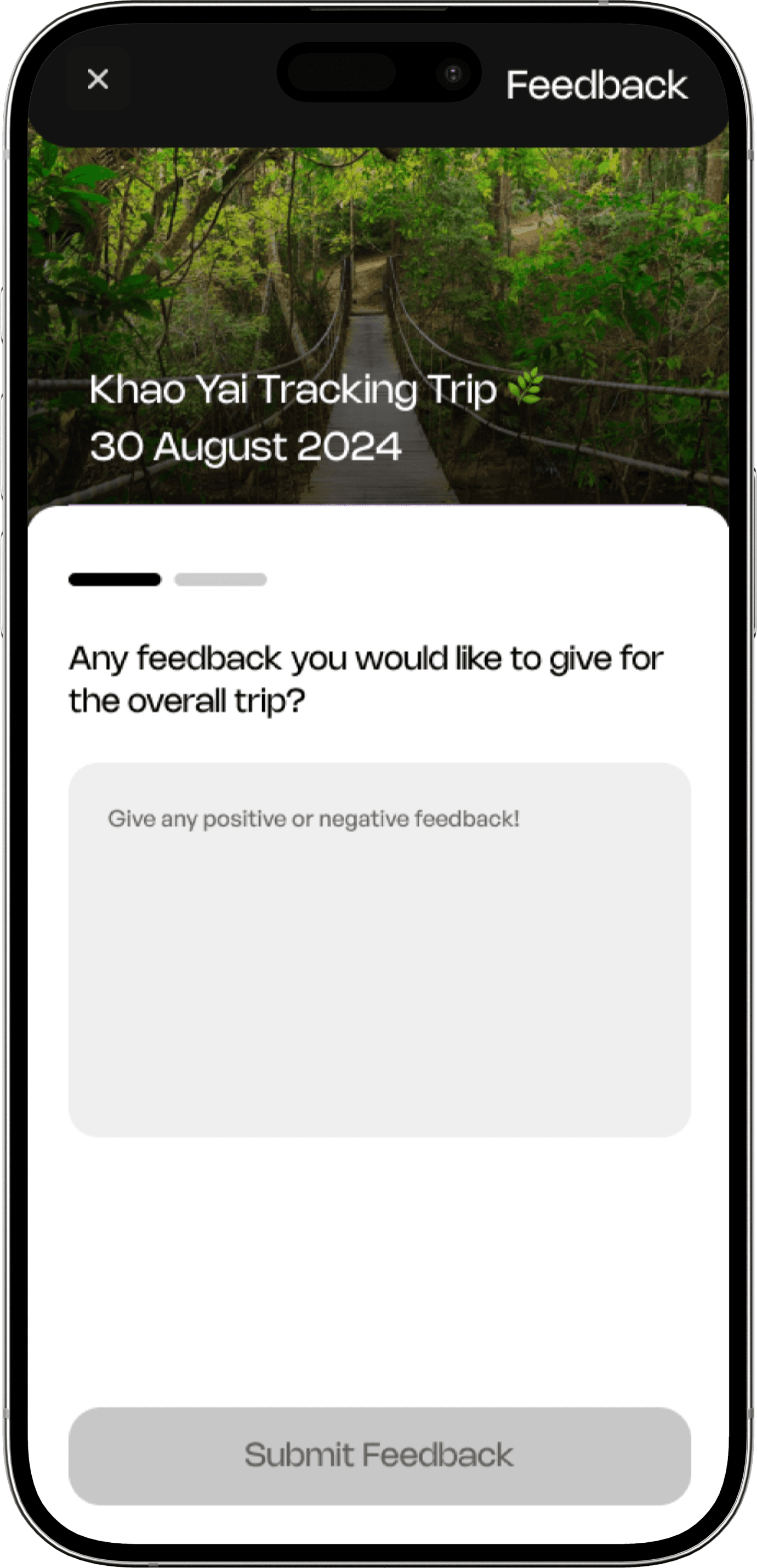
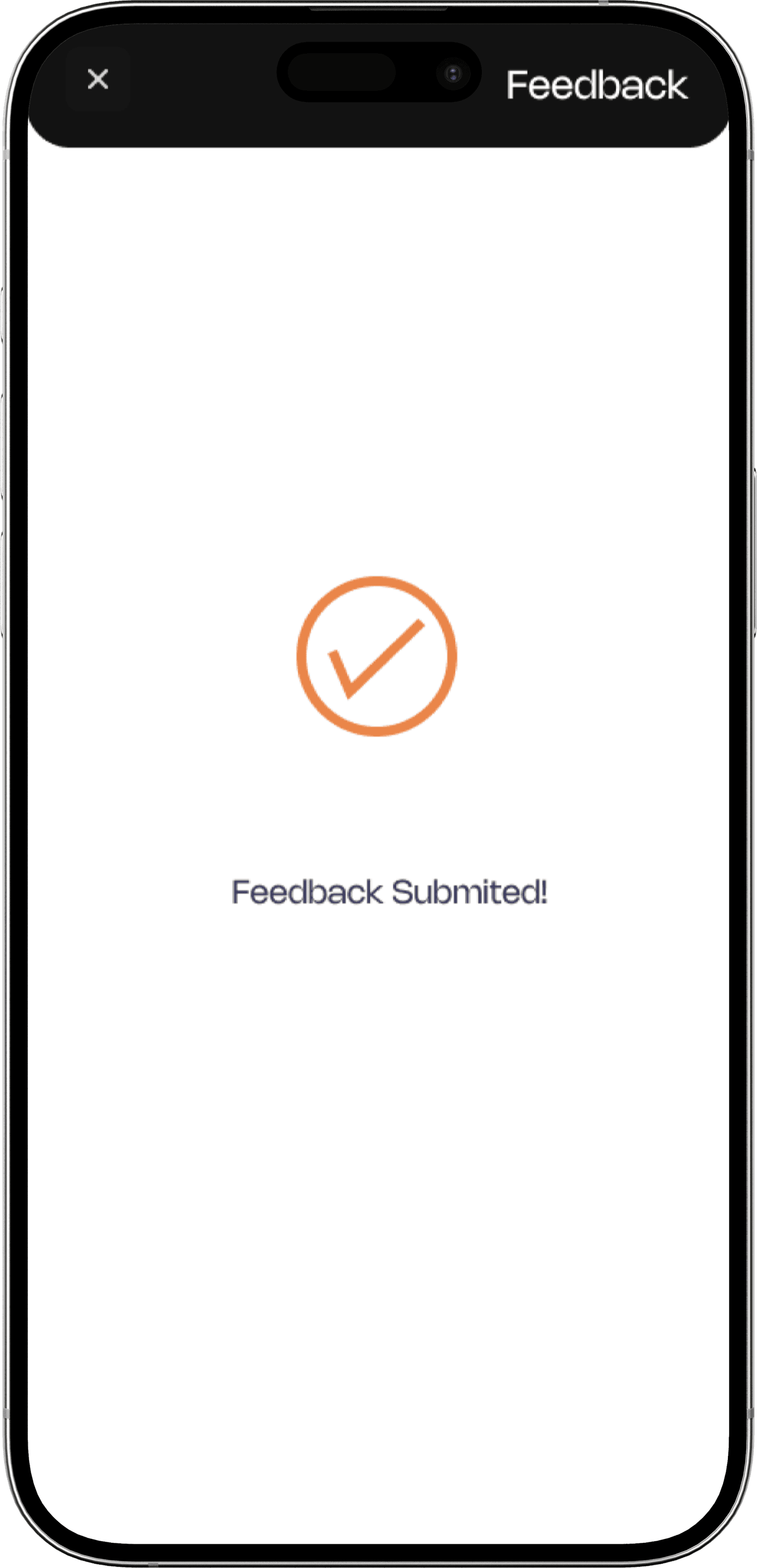
Completes surveys to share feedback and refines recommendations.
Receives personalized notification and reminders.
Shares experiences in the app’s public community forums.
Feeling
😕
🙂
😊
🥳
😌
Paint Points
Overwhelmed by existing social platforms that lack meaningful connections
Concerns about privacy or how their data will be used.
Difficulty finding users with very specific shared interests.
Events may not be accessible or relevant to all users.
Feedback mechanisms may feel too generic or unengaging.
Opportunities
Run targeted ads on platforms like Instagram or Spotify.
Offer a quick guest mode for initial exploration.
Create smart filters for better search results.
Include real-time updates on event changes.
Introduce gamified rewards for active feedback contributors.
The unique personality of our app is beautifully reflected in its thoughtfully crafted color scheme
We carefully chose our colors to make the app feel both fun and trustworthy. That Pale Orange is our friendly pop, bringing warmth and energy. Our blues – from deep reliable tones to calm Sky Blue – give you that sense of stability and clarity. A touch of Soft Yellow adds a little unexpected cheer. And for clear readability, our Navy Blues provide sophisticated contrast, all balanced by plenty of clean White. It's a palette designed to make your experience feel approachable, grounded, and uniquely ours.
The font that brands the connections and youthfulness
General Sans pairs well with Nohemi. Nohemi was chosen to align with Vibe’s youthful and tech-forward branding. The font’s sharp yet approachable aesthetics reflect the app’s mission to foster connections among students and staff, keeping things engaging yet accessible.
Aa
Aa
General Sans-Medium
Main Headers & Body
Nohemi-Medium
Labels & Captions
Shapes chosen to represent personality and diversity
To infuse our application with a unique personality and playful aesthetic, we opted for a library of organic, fluid shapes over conventional geometry.
These elements were chosen not just for their fun visual appeal, but for their ability to subtly communicate different application traits. Crucially, each user profile is uniquely identified by a distinct shape, fostering a sense of individuality and ensuring a personalized experience beyond standard avatars.


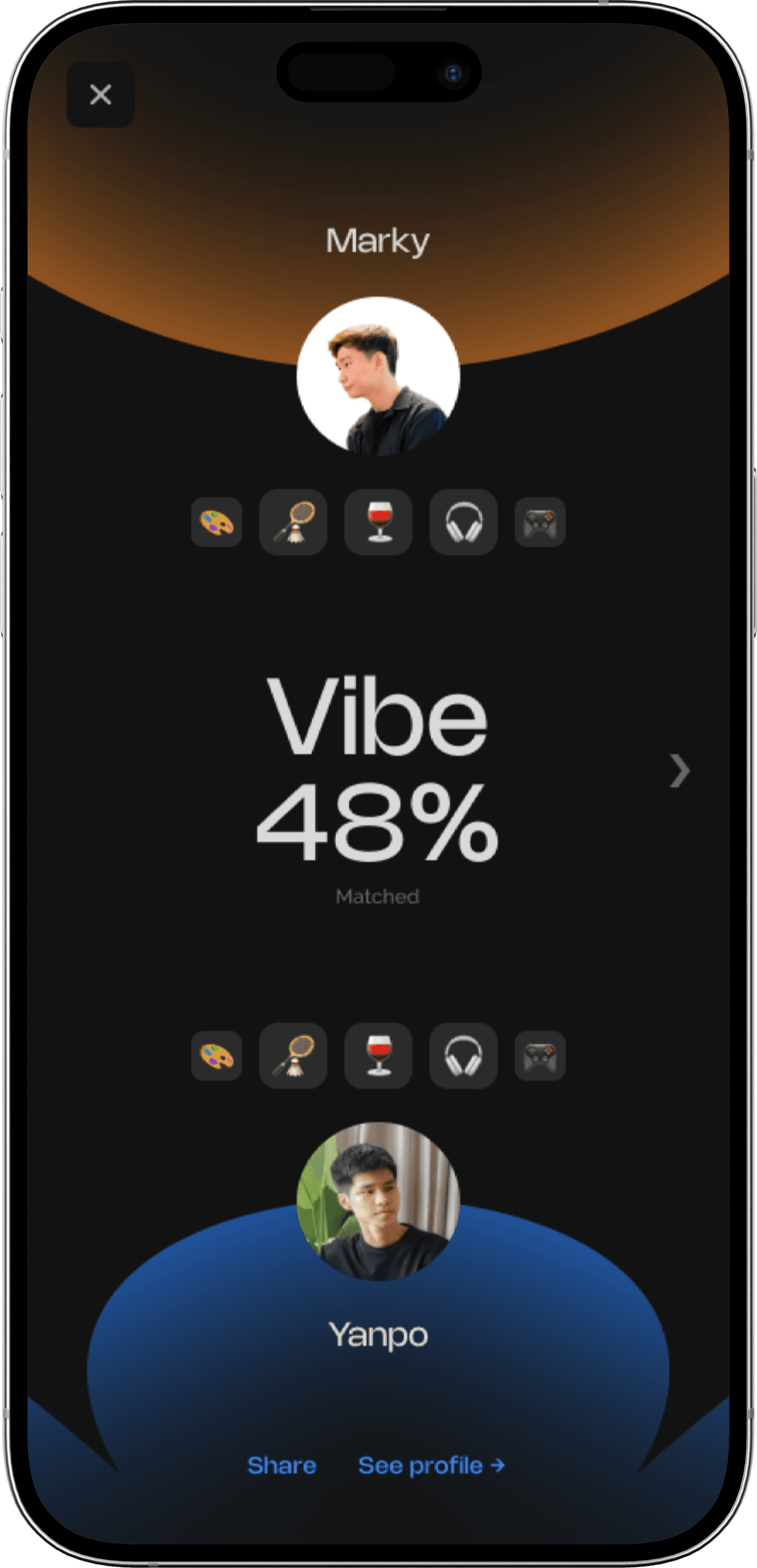
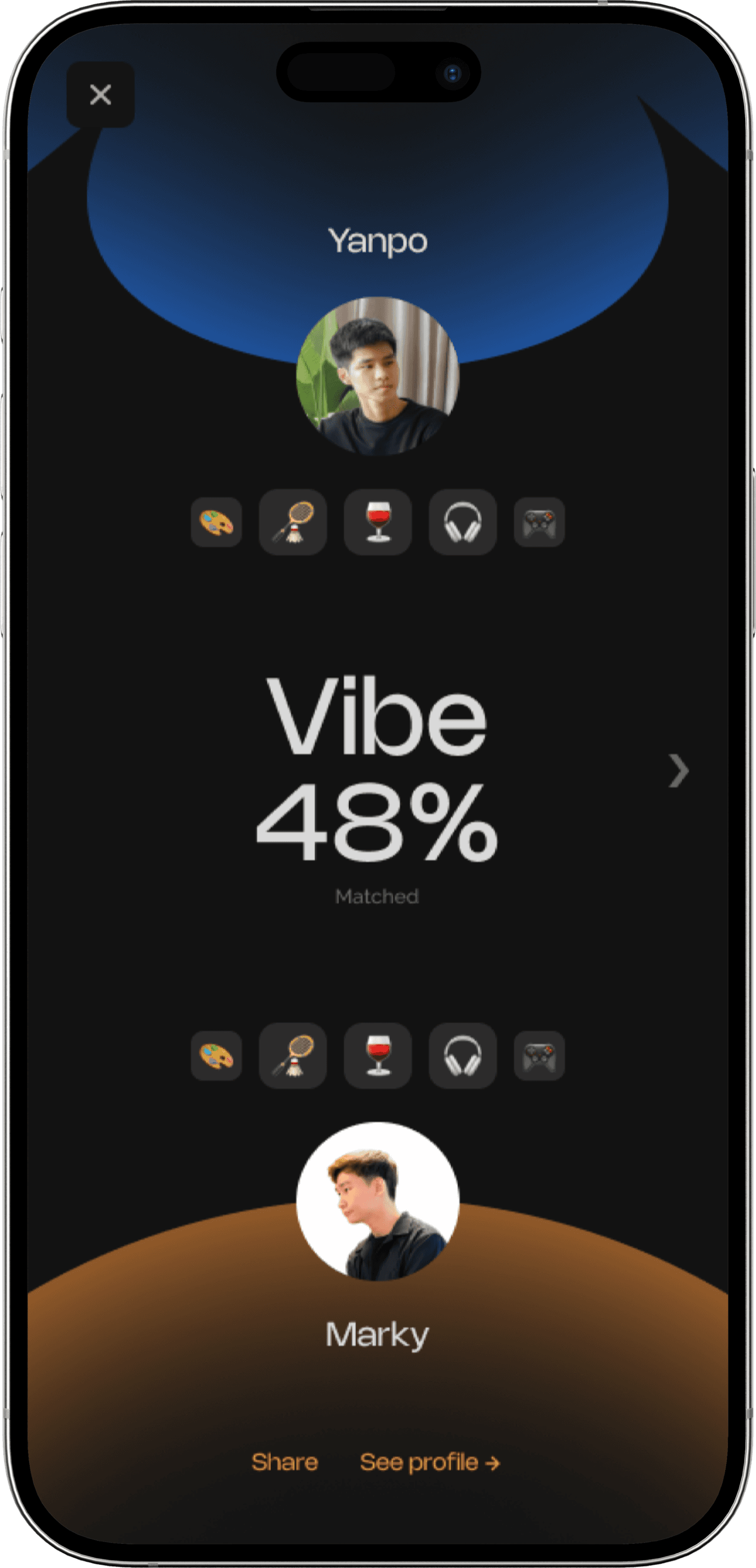
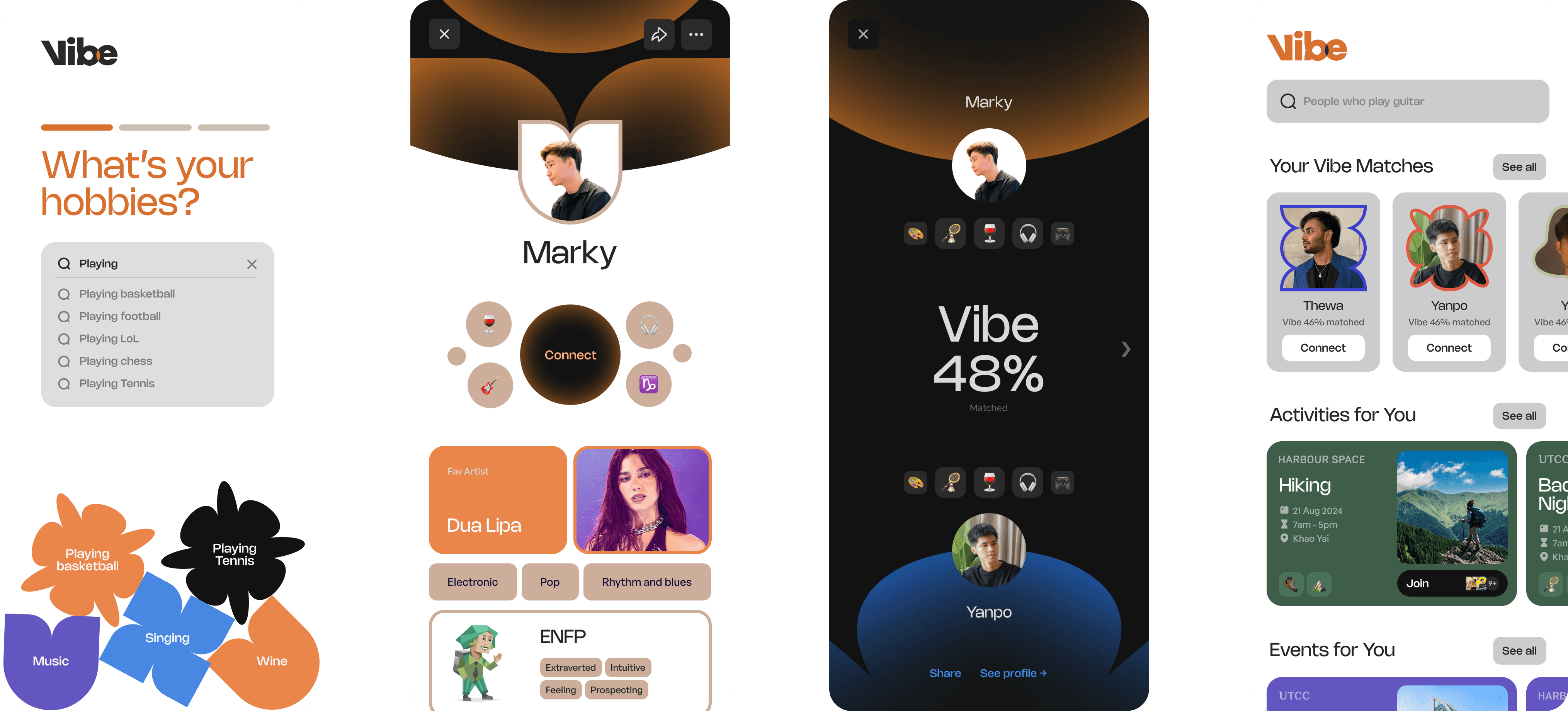
The average student experience inside the Vibe interface
Onboarding
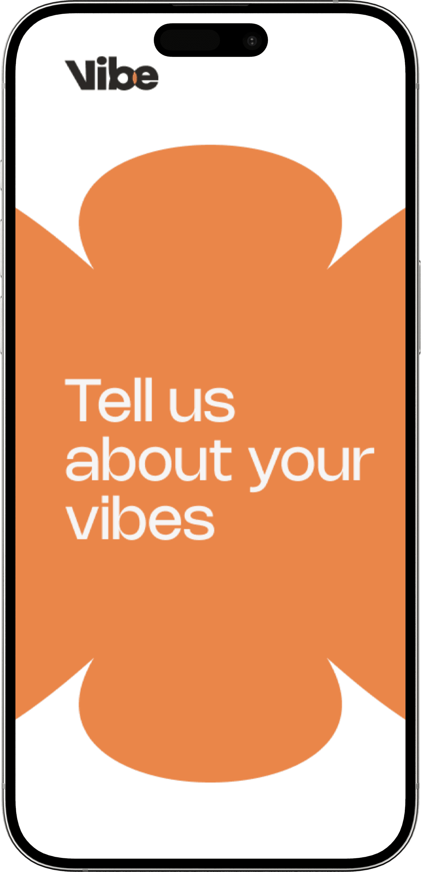
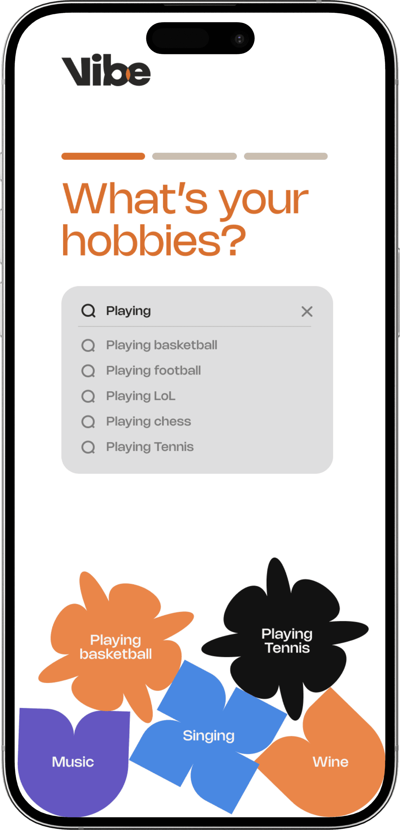
Homepage / Profile / Friend Search
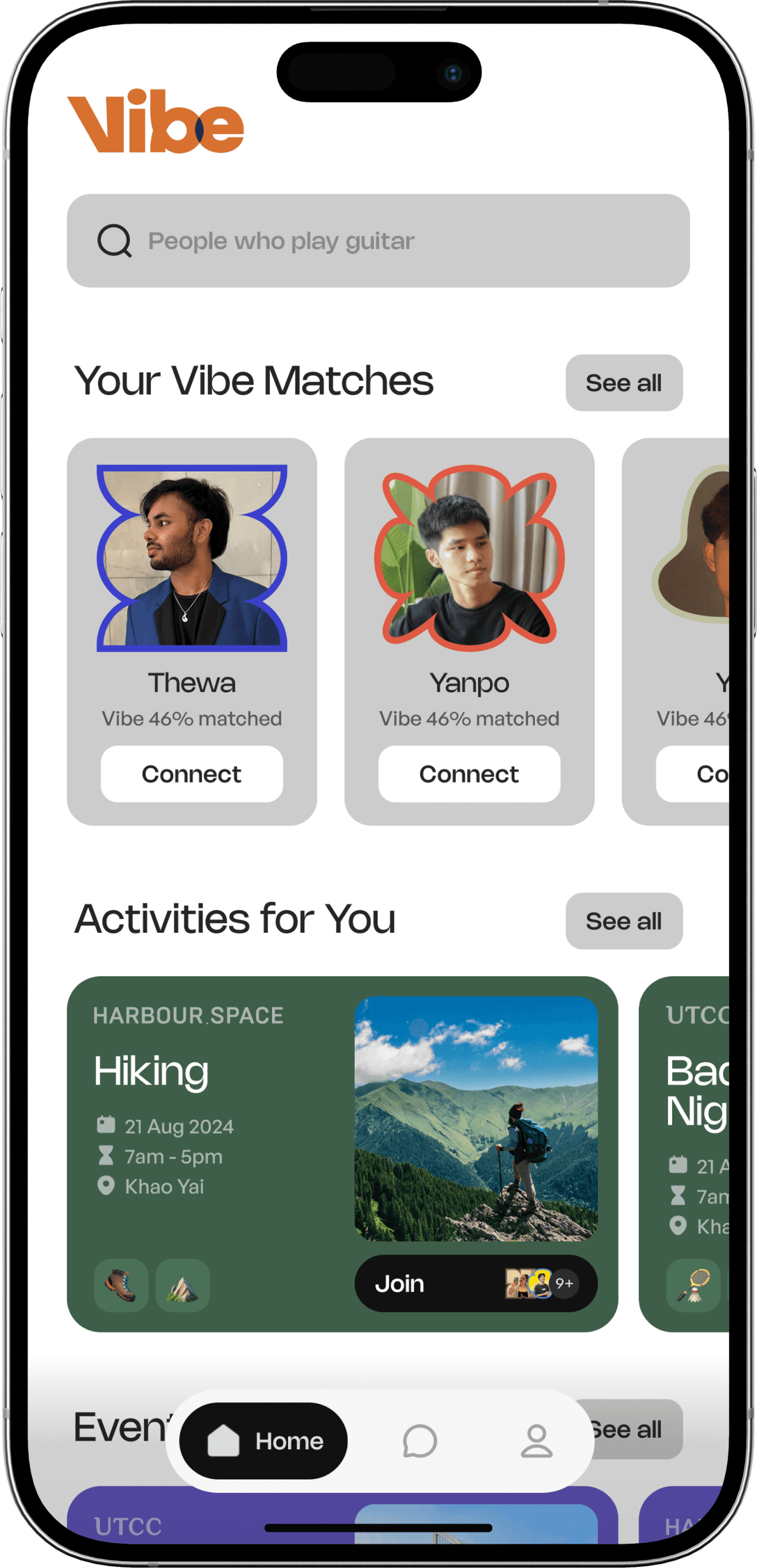
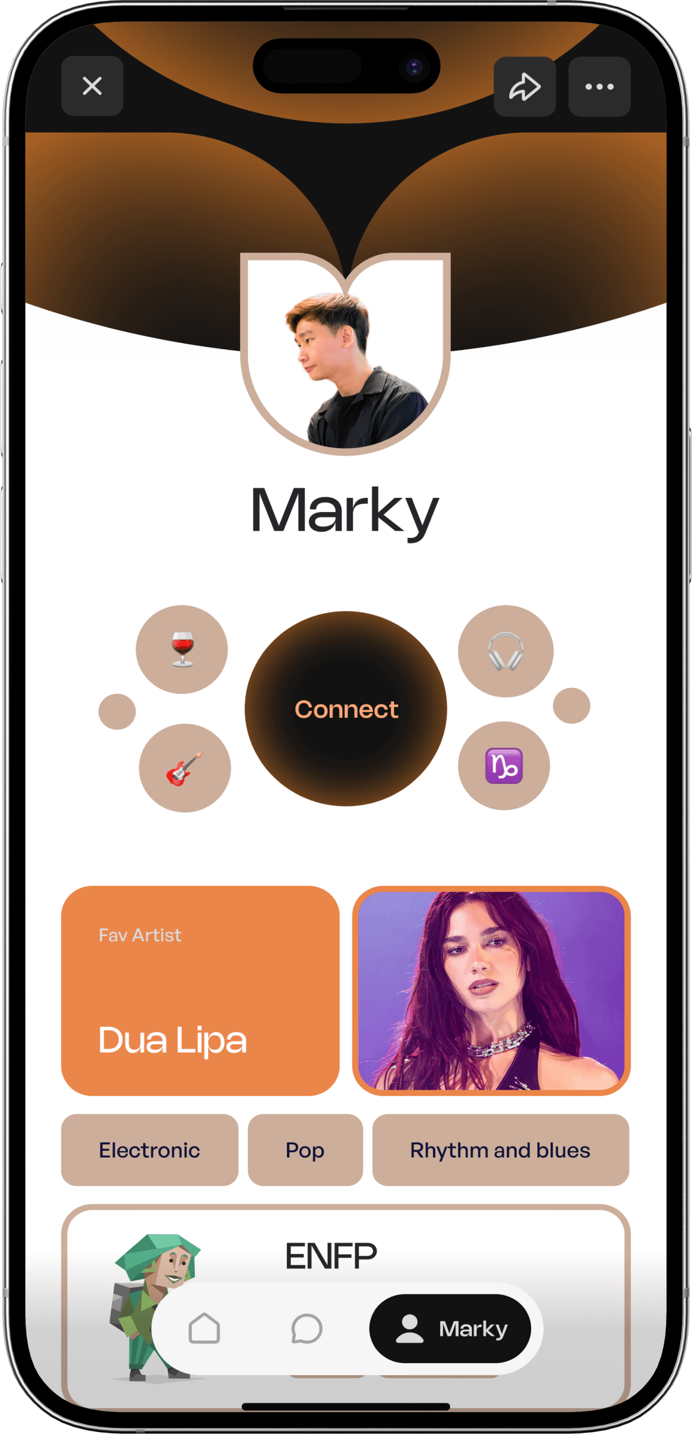
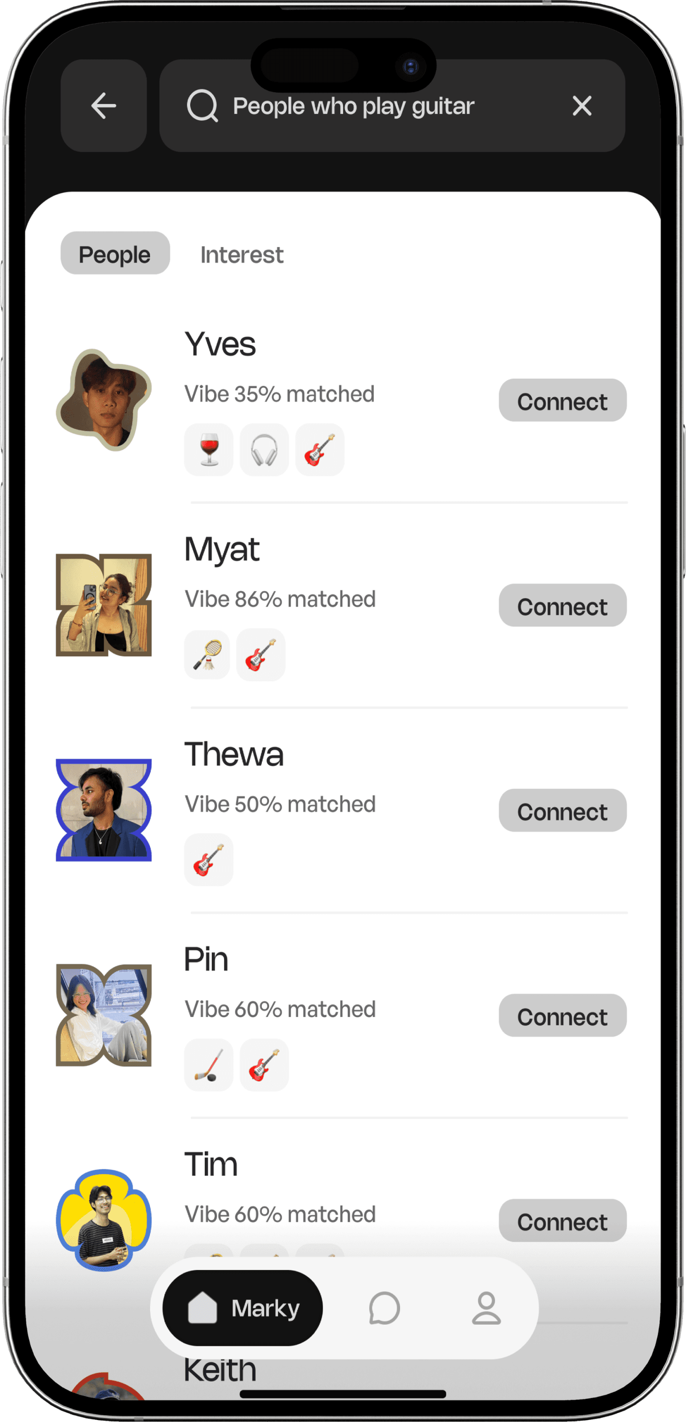
Vibe Matching
Event Joining/Feedback
Desktop dashboard for faculty members
Key Learnings: A collaborative leap in my UX/UI Journey
This UX design project offered an incredibly insightful and transformative learning experience. The opportunity to collaborate directly with digital marketing and a range of UX/UI designers was invaluable, exposing me to diverse thought processes and problem-solving approaches.
We meticulously explored numerous user flows, each iteration refining our understanding. What genuinely surprised and delighted me was discovering fresh, unconsidered nuances about the student persona, even as a student myself. This highlighted the continuous depth of user empathy.
Beyond that, meticulously adhering to a Branded Guideline to maintain a consistent UX/UI style was a practical lesson in professional execution. This project stands as a pivotal and truly foundational stepping stone in my burgeoning UX/UI career.
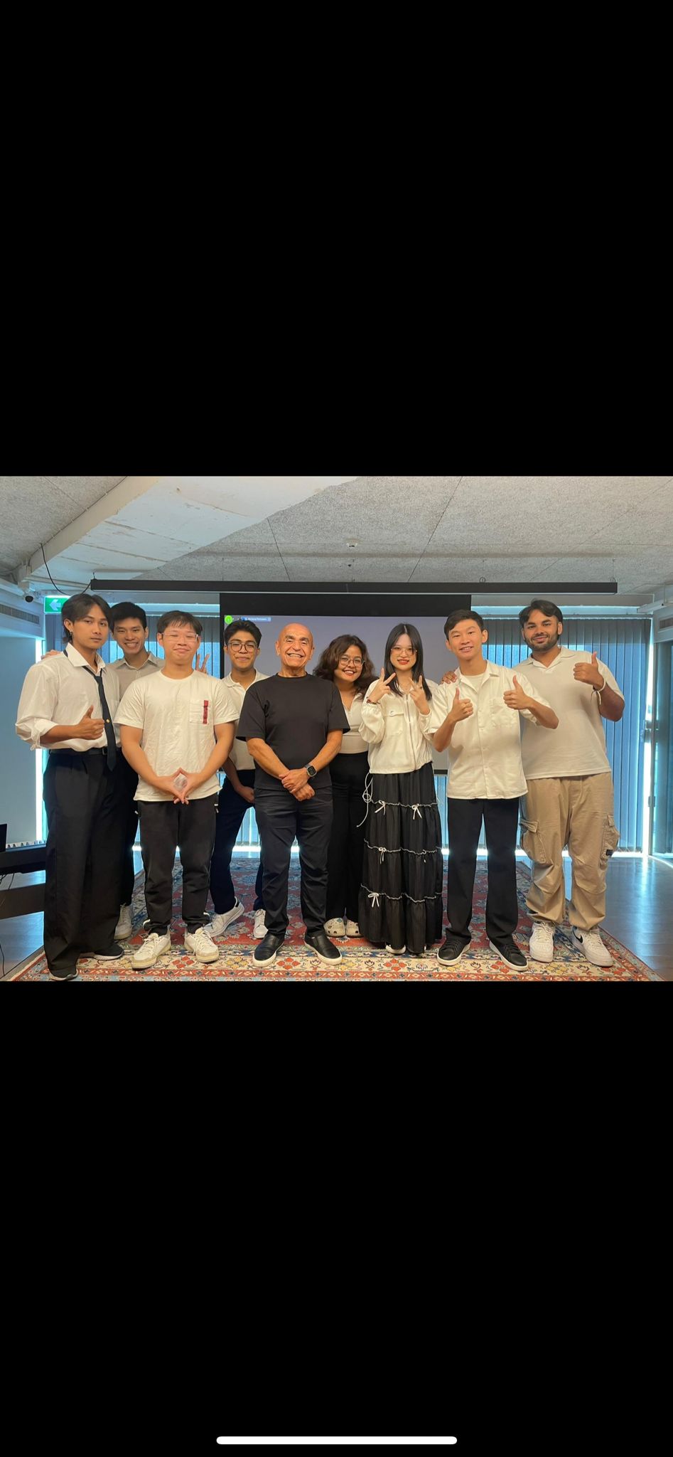

Born and raised in Malaysia, I was the art kid’ in class—going from sketching, animating, to experimenting with visuals. That love for storytelling and design naturally became 3 years into digital animation, and now into UX/UI, where I’m combining creativity and usability to make thoughtful digital experiences.
Behance
Students have a hard time finding their people, and staff juggling with too many tools
Students struggle to connect with peers, find relevant clubs, network with professors, form study groups, and feel a sense of community. On the other side, universities manage these needs through multiple, disparate tools, making the process cumbersome for administrators and reducing overall student engagement.
Creating a product that connects the students, and eases the university
To create a seamless digital product that enhances student connectivity, promotes campus engagement, and eases the administrative burden for staff members in charge of the university.
Existing platforms cover parts of the problem, but none offer a seamless, all-in-one solution
We have two main competitors, Modern Campus and ConexED, to identify market gaps and opportunities. Modern Campus is highlighted for its user-friendly interface that fosters participation, comprehensive tools for students and administrators, and a strong emphasis on community building. It also focuses on direct communication, offers flexible tools for diverse educational environments, and encourages student-faculty collaboration.
However, both platforms share similar weaknesses: they struggle with seamless integration into existing university systems, require continuous updates, and lack advanced functionalities compared to broader solutions, necessitating further integration for optimal effectiveness.
Right now, neither students or staff have the right tools to make connecting easy
We began by interviewing the key players within our existing market (our university) to gather direct insights. Our participants included:
Adapting to a new environment, seeking academic success along with a supportive social network, hoping to find a second home with others who share their passions.
CORE BELIEVES
As an international student, relies on digital tools for information, navigation, shopping, and daily tasks to adapt to his new environment.
DIGITAL BEHAVIOUR
Adapting to a new educational system and culture, building a social network, achieving academic success while managing homesickness.
GOALS & NEEDS
Marky
Uni Student
Making new friends and connections, language barriers and cultural differences, navigating international student processes, finding resources and support services.
CHALLENGES
Dedicated to creating a cohesive and vibrant campus community, looking for new ways to strengthen the connection between students.
CORE BELIEVES
Regularly uses communication platforms and management software on the school website to enhance campus operations and student experience.
DIGITAL BEHAVIOUR
Enhance student engagement in communities on campus, foster a supportive and inclusive environment, ability to accurately track data, and maintain high levels of retention rates.
GOALS & NEEDS
Kim
Faculty Member
Limited student engagement, difficulty building a cohesive campus culture, difficulty in managing diverse student needs, no student insights beyond basic data.
CHALLENGES
Making sure our users progressively feel better
We mapped out their entire journey, starting from that first spark of discovery—whether through an ad or a friend's recommendation. We considered how to make signing up feel welcoming and secure, addressing concerns like privacy head-on. Then, we focused on the magic: helping them easily find and connect with people who share their unique passions. We envisioned them engaging with exciting events and, crucially, feeling empowered to share their feedback, knowing their voice shapes Vibe's future.
Every design choice was about anticipating their needs, smoothing out frustrations, and creating a genuinely delightful experience.
Discovery
Sign-Up &
Onboarding
Explore &
connect
Enagage with events
Feedback &
Retention
User action
Sees ads or hears about Vibe through social media or word-of-mouth.
Visits the app store to download Vibe.
Explores the homepage for more information
Signs up with email,phone, or social account.
Fills out interest and preferences for personalization
Completes onboarding with short tutorial about app features
Browses profiles, find matches based on shared interests.
Sends/receives connection requests and starts chatting
Explores personalized event suggestions
Views event details, join events, and connects with peers.
Uses event channels to interact with attendees.
Gets notification for upcoming or relevant events
Completes surveys to share feedback and refines recommendations.
Receives personalized notification and reminders.
Shares experiences in the app’s public community forums.
Feeling
😕
🙂
😊
🥳
😌
Paint Points
Overwhelmed by existing social platforms that lack meaningful connections
Concerns about privacy or how their data will be used.
Difficulty finding users with very specific shared interests.
Events may not be accessible or relevant to all users.
Feedback mechanisms may feel too generic or unengaging.
Opportunities
Run targeted ads on platforms like Instagram or Spotify.
Offer a quick guest mode for initial exploration.
Create smart filters for better search results.
Include real-time updates on event changes.
Introduce gamified rewards for active feedback contributors.
The unique personality of our app is beautifully reflected in its thoughtfully crafted color scheme
We carefully chose our colors to make the app feel both fun and trustworthy. That Pale Orange is our friendly pop, bringing warmth and energy. Our blues – from deep reliable tones to calm Sky Blue – give you that sense of stability and clarity. A touch of Soft Yellow adds a little unexpected cheer. And for clear readability, our Navy Blue provides a sophisticated contrast, all balanced by plenty of clean Clean White. It's a palette designed to make your experience feel approachable, grounded, and uniquely ours.
The font that brands the connections and youthfulness
General Sans pairs well with Nohemi. Nohemi was chosen to align with Vibe’s youthful and tech-forward branding. The font’s sharp yet approachable aesthetics reflect the app’s mission to foster connections among students and staff, keeping things engaging yet accessible.
Aa
Aa
General Sans-Medium
Main Headers & Body
Nohemi-Medium
Labels & Captions
Shapes chosen to represent personality and diversity
To infuse our application with a unique personality and playful aesthetic, we opted for a library of organic, fluid shapes over conventional geometry.
These elements were chosen not just for their fun visual appeal, but for their ability to subtly communicate different application traits. Crucially, each user profile is uniquely identified by a distinct shape, fostering a sense of individuality and ensuring a personalized experience beyond standard avatars.
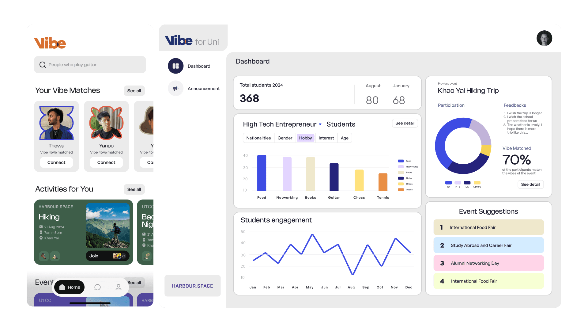
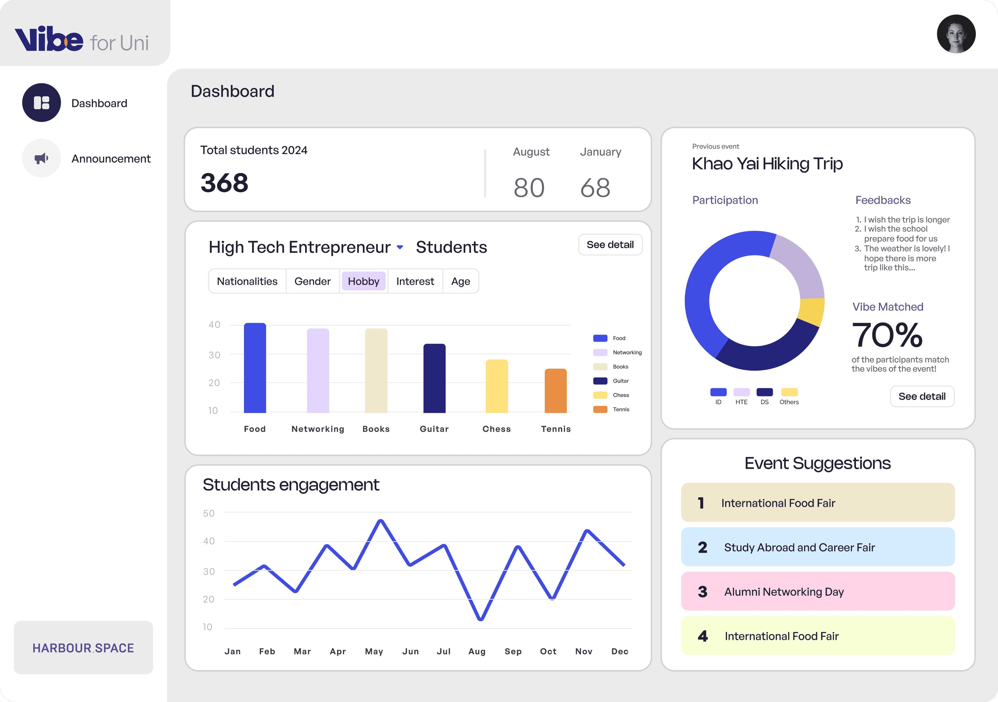
Desktop dashboard for staff members to evaluate events
As mentioned before, we have our faculty members as out secondary persona. A way to track and manage activities for events that are hosted. This dashboard is accessible through Vibe for UNI which is for staff members to view statistics.
Throughout the design we had to ensure the nessecary statistics which are used to evaluate success as well as gather feedback for future events through a controlled and well organized demographic.
The average student experience inside the Vibe interface
Onboarding
User Profile
Home Screen
Vibe Connection
Key Learnings: A collaborative leap in my UX/UI Journey
This UX design project offered an incredibly insightful and transformative learning experience. The opportunity to collaborate directly with digital marketing and a range of UX/UI designers was invaluable, exposing me to diverse thought processes and problem-solving approaches.
We meticulously explored numerous user flows, each iteration refining our understanding. What genuinely surprised and delighted me was discovering fresh, unconsidered nuances about the student persona, even as a student myself. This highlighted the continuous depth of user empathy.
Beyond that, meticulously adhering to a Branded Guideline to maintain a consistent UX/UI style was a practical lesson in professional execution. This project stands as a pivotal and truly foundational stepping stone in my burgeoning UX/UI career.

Born and raised in Malaysia, I was the art kid’ in class—going from sketching, animating, to
experimenting with visuals. That love for storytelling and design naturally became 3 years into digital animation, and now into UX/UI, where I’m combining creativity and usability to make thoughtful digital experiences.